Thursday, November 8, 2012

Expedia Place Summary Statement

(I have called the proposal Expedia Place as it reflects an experiential journey undertaken by a large group of varying users)

The inevitable projection of urban issues, particularly that of population growth, has placed social sustainability at the forefront of design in the year 2030. The recent emergence of an inverted Brisbane CBD has resulted in residential functionality becoming physically central, while the commercial zone shifted outwards. This transition has set the foundation for the potential to form a complete community that thrived on mixed social activities. This was made possible through the CBD vehicle ban, creating a purely pedestrian location that has begun to regain its connection with the natural environment. 

Expedia Place reflects this vibrant evolution of the modern day city by providing for the new urban needs and values, as well as for the indeterminacy of the future. The centre is a complete redevelopment of the former Myer Centre that absorbs and provides for its environment rather than merely existing within it, aiding in the realisation that modern cities have started to lose touch with nature.


Spatial Allocation and Transition


As can be seen from this section, the three separate parts of the building have evidently different functions, yet the spaces still flow from one to another despite the need for vertical transition. For maglev users to reach the ground floor, they must traverse the ramps that bypass the retail area of the building, providing a visual interaction. Even so, there are multiple directions and paths to choose from to continue the concept of free circulation between spaces. This allows direct or indirect routes to be taken, allowing the building to be utilised for exploration and mixed use, or strictly as a thoroughfare between planes.  


This diagram creates a visual representation of the different zones that cater towards different types of users. Yellow is a mixed zone, blue is a non-cbd resident zone on level with the maglev stations, and green is for residents as it is located on the ground level where these users would always access the building, unless arriving from a trip out of the CBD. I have created a series of vignettes that follows each of the user types on their separate journeys through the building.

CBD Resident


Non CBD Resident


As can be seen, some of the locations overlap, including the roof space. This is because the spaces transition into one another and there are no physical barriers for space and activity allocation to allow a successful mixed use building that forms a complete community

Connectivity

As mentioned earlier, the location of the Myer Centre was key to its acquisition as the site for the future proposal due to its positioning at the cusp of the new residential and outer commercial zones. This meant that it is situated next to a maglev station, which started the entire intiative for using the building to provide an additional level to CBD circulation.   


Because of this raised level occupied largely by non-CBD residents, the potential for a city-wide network is formed that could be a possibility for an even further future scenario. Below is a diagram demonstrating possible connections that may be introduced. 


The image below shows the view from the maglev station situated to the south of the redeveloped myer centre.


Final Floor Plans


My final ground floor plan ended up having more elements than initially planned as it was pointed out that grass would only grow in certain areas due to limited natural sunlight. In order to counteract this reduction in the ability to use grass (I used mulch in most areas instead), I utilised a lot of timber decking and pathways to add more usable space that still felt natural. Many trees and other plants could still be used paired with the timber as well as many species don't require a lot of sunlight. All areas except the north corner and south west edge are directly accessible to the street which enabled a successful parkland type space to be created where users (particularly CDB residents) don't feel that they are in or underneath a building. 

I kept the interior retail levels very similar to how I initially planned as the individual shops show a subtle yet important transition towards a new way of functioning. By maintaining small spaces without extensive storage or back access, the tenants are forced to limit their products and purchase only what they believe they will sell in the near future. This will reduce waste spatially as well as materialistically.

The roof space ended up similar to the ground space, intended as a parkland inspired area. The curved hills, hollowed out by restaurants and cafes, provides an organic feel backed up by the large grass cover. This three dimensional floor plan can be seen below.


Final Facade and Roof Decision

After experimenting with multiple possible facade shapes I decided upon a fairly simple, modified rectangle that angles up and outwards on two sides to create faces that appear to open vertically to provide the illusion of more interior space. The reason for maintaining the simple shape was that it worked most effectively with the expansion and retraction that was required to manoeuvre around the extensive ramps.


I also decided to leave the roof space open, as when I tried placing the facade over the roof area, it appeared very enclosed and small, which is the opposite of the atmosphere I intended. This also allows an unobstructed view towards the river to increase the focal connection to the surrounding environment.


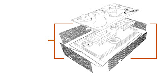
I have produced a diagram that more adequately demonstrated the separate elements used in the construction of the overall building, where the facade makes up the outer, most adaptable and easily removed aspect of the structure. As discussed in an earlier post, the permanent interior grid (created from the skeleton of the original Myer centre structure with removed lower floor plates) is kept simple for the ease of space reassignment in the future. The interior retail walls are non-load bearing to allow for easy restructuring in the future if the functionality of the building is to change. By have such a combination of elements, the building will last for many years and can be re-purposed numerous times for a large variety of activities. 

The facade is composed of three varying bronze aluminium mesh panels that can be stacked and transported to the site for installation. Here they are bolted together and attached to mechanical sliding tracks located alone the bottom of the floor plates and ramps to provide the required inward and outward movement of the facade. 


Here you can see the facade extended during normal hours to provide more interior space while the outer ramps are less likely to be used as a direct thoroughfare. This also allows more space for edge activation  such as the cafe and seating in this image.


This image portrays peak hour when the facade is retracted, as many workers and visitors are entering or leaving the city via maglev and require the extra ramp space as a thoroughfare. This reiterates the focal point of social sustainability and its importance in the future as population growth continues at a rapid pace, requiring direct actions to be taken to maintain a high quality of life in the modern day city.


As mentioned beforehand, I removed the facade from directly above the building, so to protect users from the harsh sun in the summer I provided multiple shading structures, which also ended up acting as a partial cover to the light tubes. This also means that in the winter the direct sun will be beneficial for passive heating.


As the shade structures consists of layers of angled triangles, strong rain is slowed down to prevent horizontal rain from entering unwanted parts of the building by directing it downwards into the light well to successfully produce the sought after interior rain effect.


Tuesday, October 16, 2012

Materials

As the interior of the building is composed of a large skeletal structure of the previous Myer Centre, it will be largely reinforced concrete supported by large columns, allowing the exterior glazed wall to be non-load bearing. I want to maintain this brutalist structural style to maintain simplicity. On the other hand though, the interior shops will be colourful and uniquely decorate in order to draw attention and provide a noticeable contrast to the rest of the building. In doing so, the retail goal of creating strong focuses for passers-by will be achievable despite the reversed layout of the floor plan. 


The treatment I want for the concrete is the same as that in Studi-o Cahaya in Indonesia by Mamostudio. This can be seen below. 


The exterior facade will be composed of either bronze or copper aluminium mesh, assembled in adjoining panels. The bronze or copper colour will adhere to organic design to suit the re-envisioned CBD that aims for a reinvigorated natural environment. Below is an example of this same material used in a facade, though in a different manner. 


Multifunctional Light Wells

Rather than closing off the light wells at the roof level, I have decided to leave them open to the elements, allowing rain to penetrate the building. In doing so, the theme of maintaining a strong connection with the outer environment is upheld while providing a unique interior. Apart from this, it provides functional benefits as it allows rain to reach the plant life below for necessary watering. It also provides a sustainable means to provide water for the water features planned on the ground floor. 


After some calculations and exploration, I found that the most effective way of preventing water from entering the floors of the building is to provide an interior tube for rainwater direction. If the tube is suspended within the light wells, space between the glass enclosure and the floor plates will allow vertical or low-angled rain to enter on the outside of the tube for a natural, open rainfall. However, when the rain is heavier and angled due to high wind, it will only enter on the inside of the tube and through dripping on the outside to prevent the rain from being directed into the building beyond the light well opening. The top floor plate will also have a slightly smaller opening so that vertical rain keeps a small distance from the edge of the interior floor spaces. I have also noted that the lightweight suspension system for the tube must angle down and inwards to allow water to drip towards the tube as it gathers on the suspensions.


Friday, October 12, 2012

Landscaping and Façade Feasibility

As suggested to me last week, I began experimenting with variations on the shape of the façade  Due to the existence of the large light wells and their importance in providing light to the space beneath the structure, I decided that the façade should respond to the sun be angling towards the north. This way the sun will enter the space beneath the façade more directly and provide more sun below. Although I haven't finalised a design yet, I will begin to produce a 3D model to help visualise this element much more in order to choose the most fitting shape. 


I also used the dimension of the streets to explore the feasibility of providing a "natural" topographic sloping form that aids in the transition between levels in the structure. I chose 20 degrees for the hill slope as it can be slightly steeper than a built ramp. Even so, there is also a ramp along one side as it must be wheelchair accessible all the way from the street level. A stairway should also be provided for those wishing to travel between the spaces in a less leisurely manner. The side running parallel to Queen Street may be terraced to provide a variance in provided landscape, though this is still purely conceptual and will also benefit from exploration through 3D modelling. 


Floor Plan Development

I acquired the dimensions to the Myer Centre in order to begin creating floor plans, which measure 160m long (parallel to Queen Street) and 95m wide (parallel to Albert Street). Albert Street also slopes downwards towards Elizabeth Street, creating a height difference of approximately 3m. A similar slope starts on George Street and extends down towards Albert Street, but is closer to a 5m difference. Because of this uneven topography, along with the removal of the lower floors of the Myer Centre creating a void in the ground, I want to provide infill to the ground level that creates a slope aligning to the natural slope of the exterior streets. At certain points where a slope is impractical (such as under the proposed restaurant) the ground will become terraced.

The major elements and characteristics that I want to include in this resident-directed level are

  • overall natural parklands atmosphere
  • sports amenities and rental shop (out of scale on drawing)
  • bike amenities - a car-free Brisbane will be much more heavily focused on bicycles and their provision
  • restaurant and cafe(s)
  • body of water (likely for swimming) 
  • pathways
  • vegetation - must research plant life that requires little sunlight to thrive


I also explored multiple floor plan layouts for the retail areas based around major light wells. I decided on the plan with three wells, as it allows fluent circulation as well as multiple shops to be integrated, including a large Myer Centre store in the middle. It also allows service corridors to run behind each of the shops. The chosen layout also creates a stronger relationship with the exterior walkways, allowing for the two to work together to support additional instalments such as coffee shops and seating, which will be developed much further. 

By having smaller shops, they become more sustainable as less products can be ordered and stored within the retail spaces, requiring more utilisation of space and less waste. It also creates a higher turnover as products will be ordered as they are needed, rather than ordering bulk items that are never purchased. 


Saturday, October 6, 2012

Façade Similarity

I came across a building that I had seen briefly a long time ago called The Orange Cube in Lyon, France, designed by Jakob + McFarlane Architects. The idea of a mesh façade enveloping a structure that I have used is very prominent in this building, along with the circular perforations. This can prove useful by exploring the materials used in this building as they present a very successful, and similar outcome to what I want to achieve. The article on ArchDaily states that this façade reconciles thermal performance and visual performance from the interior with a daylight factor of 2%, showing that my idea of an adaptable, mesh façade not only aids in social sustainability through circulation, but also environmental sustainability through the reduction of heat loading and reduction of reliance on mechanical heating and cooling.


Thresholds and Detail

An important aspect of any building is the way in which it is entered. This is especially important for my redevelopment of the Meyer Centre, as such an immense structure needs to keep the appearance of being at human scale. I want to achieve this through focusing on the end point of the façade at the base of the building, as it will shape the opening. Just by existing alone, the façade already softens the harsh edge of the rectangular building to reduce the appearance of entering a void beneath a large structure. 


In the lecture, we had a guest speaker who studied in USA and has opened her own firm in Istanbul. In the designs she presented, she often dealt with large structures that were composed of complex interiors that were reduced to the human scale through extensive detailed elements. She also talked about activating spaces deep within the building that wouldn't normally see much traffic, but encouraged exploration through the installation of narratives that created activity within the space. I found her approach to the design of large spaces very intriguing, and has resulted in me feeling the need to incorporate detailed elements throughout the interior design to create a sequence that unravels throughout the large space. An example of her work can be seen below:

Salt Research Centre, Istanbul - SANAL Architecture (http://www.archdaily.com/199709/salt-research-center-sanal-architectureurbanism/)

I experimented with some very quick and rough ways of adding detail to the ground floor opening that reacts to the extension and retraction of the facade (as seen below). However, DaVor noted in the tutorial that it was probably best to keep this area simple and not to over complicate it. It will probably be best to reserve this detail for the interior spaces.